
BiYu
BiYu
BiYu
An a all natural skin care brand
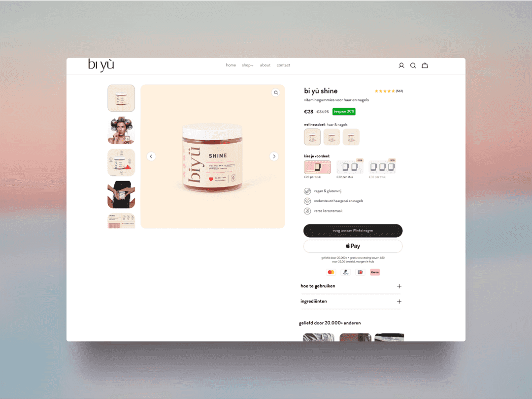
BiYu, an all-natural skincare brand, approached me to modernize their product page experience. The goal was to create a clean, responsive design that aligned with their minimalist aesthetic while improving product storytelling, conversion flow, and mobile usability.
I led the UX/UI design process from strategy to final visuals, focusing on optimizing content hierarchy, product imagery, and customer trust signals. The result was a visually refined layout with improved readability, a stronger mobile experience, and clearer calls to action — all designed to support better engagement and drive higher add-to-cart rates.
Scope of Work:
Responsive product page design in Figma
UX improvements for mobile-first flow
Updated layout for ingredients, reviews, and usage info
Visual direction aligned with BiYu’s brand values (clean, natural, premium)
Developer-ready handoff with annotations
Problem
BiYu’s existing product page lacked a modern design and mobile responsiveness, making it difficult for users—especially on smaller devices—to engage with product content and complete purchases. The layout was cluttered, the visual hierarchy was unclear, and essential product details were not easily accessible, leading to a poor user experience and potential drop-offs in the conversion funnel.
BiYu’s existing product page lacked a modern design and mobile responsiveness, making it difficult for users—especially on smaller devices—to engage with product content and complete purchases. The layout was cluttered, the visual hierarchy was unclear, and essential product details were not easily accessible, leading to a poor user experience and potential drop-offs in the conversion funnel.
BiYu’s existing product page lacked a modern design and mobile responsiveness, making it difficult for users—especially on smaller devices—to engage with product content and complete purchases. The layout was cluttered, the visual hierarchy was unclear, and essential product details were not easily accessible, leading to a poor user experience and potential drop-offs in the conversion funnel.
Solution
I redesigned BiYu’s product page with a clean, modern aesthetic and a mobile-first approach. The new layout prioritized clear information flow, high-impact product imagery, and simplified calls to action. Key content such as ingredients, reviews, and usage details were reorganized into intuitive, scannable sections. The result was a more engaging, trustworthy shopping experience that aligned with BiYu’s brand values and made it easier for users to confidently explore and purchase products across all devices.
I redesigned BiYu’s product page with a clean, modern aesthetic and a mobile-first approach. The new layout prioritized clear information flow, high-impact product imagery, and simplified calls to action. Key content such as ingredients, reviews, and usage details were reorganized into intuitive, scannable sections. The result was a more engaging, trustworthy shopping experience that aligned with BiYu’s brand values and made it easier for users to confidently explore and purchase products across all devices.
I redesigned BiYu’s product page with a clean, modern aesthetic and a mobile-first approach. The new layout prioritized clear information flow, high-impact product imagery, and simplified calls to action. Key content such as ingredients, reviews, and usage details were reorganized into intuitive, scannable sections. The result was a more engaging, trustworthy shopping experience that aligned with BiYu’s brand values and made it easier for users to confidently explore and purchase products across all devices.
We help you create and earn on your terms.
We help you create and earn on your terms.
We help you create and earn on your terms.
Based in
Traverse City, Michigan
Based in
Traverse City, Michigan
Based in
Traverse City, Michigan